The new brand of Regal Springs: Naturalmente Mejor Mojarra Mexicana
Brand Identity / Digital / Experiences & environments / Implementation
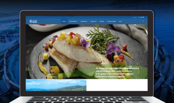
Regal Springs is a firm that breeds the best fresh and frozen tilapia in Mexico. They are always taking care of the environment and contributing to the economic development of their communities, which are focused on aquaculture. We created a mixed Brand with the international seal of “Regal Springs” and the name “Naturalmente Mejor Mojarra Mexicana” and designed the packaging for all the lines of its fresh and frozen products.
Our objective was to develop a “royal” Brand with a solid personality that conveyed prestige, trust, and, at the same time, the “expertise” of a firm that leads on the field of aquaculture globally with the particular style of “Regal Springs.”
We designed distinctive typography to create a unique personality for the Brand that communicated the roots of the country; at the same time; we wanted it to be atemporal for its different uses and its permanence in the market.
For the design of its packaging, we developed a line of frozen and fresh products with a unifying element: the silhouette of the tilapia, and we established an identification system that will allow the consumer to do a quick review of the contents and identify its key components.
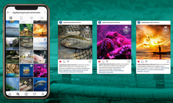
The pictures were taken especially for every product; our starting point was the “Visual Territory” created especially for “Regal Springs.”
For this project, we developed: the Visual Identity, the Packaging Design, the Digital and Traditional Implementation, and the environments to give new life to the Brand.
Related Projects