Cafetal El Equimite
Brand Identity / Brand Strategy / Experiences & environments / Implementation / Naming“Cafetal El Equimite,” a biodynamic organization in full Bloom, with a great passion for all they do and great respect for the environment, the biodiversity of our ecosystem included.
The symbol of the Brand is a representation which, in a considerable measure, owes its potency to the particular language it uses, as it conveys unique characteristics of “Cafetal El Equimite,”. The form of the horns conveys the dynamism of a continuous movement, constant and perdurable, and it also refers to the concepts of sky and earth. And its engraving finish is inspired by the processes within El CAFETAL (humane and devoted). We designed a unique font for the logo, inspired in anthroposophy, to produce typography with a unique personality for the Brand and to incorporate specific visual criteria that belong to this particular current.
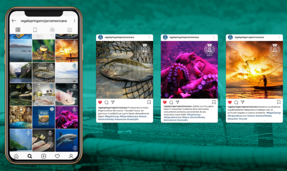
Related Projects