Te presentamos la nueva Marca de Regal Springs “Mojarra Mexicana”


We created a composite brand with the international seal “Regal Springs” and the brand name for Mexico “Mojarra Mexicana,” later developed all its implementation at the traditional and digital level.

The objective was to develop a “Real” brand with a strong personality that would denote prestige, confidence and, at the same time, transmit the “expertise” of a leading global aquaculture company very much in the style of “Regal Springs”. Distinctive typography designed to create a unique personality for the brand that would communicate the country’s roots, and at the same time, be timeless for its different uses and permanence in the market.

For the creation of their packaging line “Mojarra Mexicana” we developed a unique and differentiating graphic style for the fish category (Fresh and Frozen), from the type of packaging, to the “Visual Territory” created especially for “Regal Springs”, supported by the photographer @Yuri Benitez and the expertise of economa @Brenda Garcia we managed to transmit through the images, the flavor and texture of the product we wanted to achieve, making it more appetizing and attractive on the shelf.

Regal Springs Tilapia is a company that cultivates the best fresh and frozen mojarra-tilapia in different countries such as Indonesia, Mexico, Honduras, taking it to several markets among other USA and Canada, always taking care of the environment and collaborating with the economic development of the communities that dedicated to the aquaculture.
Grupo Pellas presents its new financial brand, developed by 360Brand


The new Avanz brand is the new generation of financial services created by Grupo Pellas. Last year, this portfolio was acquired as Banco ProCredit.

Avanz is a new bank that breaks the status quo focusing on the Small and Medium-sized Enterprises that want nothing but the best, through highly personalized and innovative financial services. Avanz serves SMEs with the best technologies and human warmth, offering portfolios tailored to the needs of its different clients.

For this project, we developed this new bank’s branding strategy, its naming, its visual identity and its implementation and its communication strategy.

The Avanz brand is defined as an agile name, that manifests dynamism, success and a future.  Its visual identity is a symbol that goes always forward towards the encounter of elements, that bring together an alliance between Grupo Pellas, technology and innovation.

BRAND MANIFESTO MUKUL, GUACALITO DE LA ISLA


Translate the brand essence and all workshop outputs into a global manifesto that help us bring more clients to Mukul / Guacalito de la Isla.

WHAT IS THE BIG AND POWERFUL INSIGHT THAT WILL HELP US BRING MORE CLIENTS TO MUKUL & GUACALITO IN THE YEARS TO COME?
Design by nature, Genuine people, Barefoot luxury, Nicaragua our best kept secret (because that is what we are made of)/

“SANTUARIO DE ENERGÍA NATURAL” FOR AFFLUENT TARGETS

BALANCE SEEKERS:  The power of nature and genuine experiences to restore and reconnect with what really matters

EXPERIENTIAL TRAVELER:  A unique conjunction of natural beauties, exotic destination and genuine people to create the extraordinary experiences that nourish them.

TRENDY INFLUENCERS:  Adventure and exclusivity full of mysteries and very well kept secrets.

Rediseño de la identidad gráfica Hospital Vivian Pellas

Toda cambio obliga a una evolución. Hoy, el logotipo del “Hospital Vivian Pellas” se renueva a través de una tipografía moderna con la cual expresamos calidez, humanismo confiabilidad, experiencia e innovación.
El símbolo se renueva y se simplifica, conservando los equities principales de la marca, es decir se mantuvo la referencia formal/conceptual del símbolo anterior, pero la ejecución cambia de manera evolutiva.
¿Porqué era necesario realizar un cambio de marca?
La relevancia del nuevo cambio de nombre “Hospital Vivian Pellas” y su vigencia por más de 10 años ofrecía la oportunidad de rediseñar la identidad de la marca. Detectamos algunas por las que tenía la oportunidad de evolucionar su marca hoy:
1. Cambio de nombre
2. El diseño perdió vigencia
3. El símbolo era difícil de recordar o reproducir
4. Se necesitaba reforzar la comunicación de la estrategia de marca
Estructura de diseño
Con el fin de asegurar y extender la vida útil, eliminar la monotonía y ampliar las posibilidades del sistema gráfico se realizó un layout sencillo y flexible diseñado para reforzar la esencia de la marca, basándonos en una parte del símbolo como “Elemento unificador”

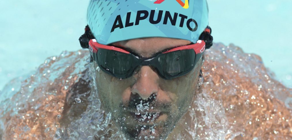
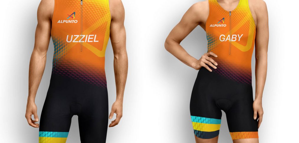
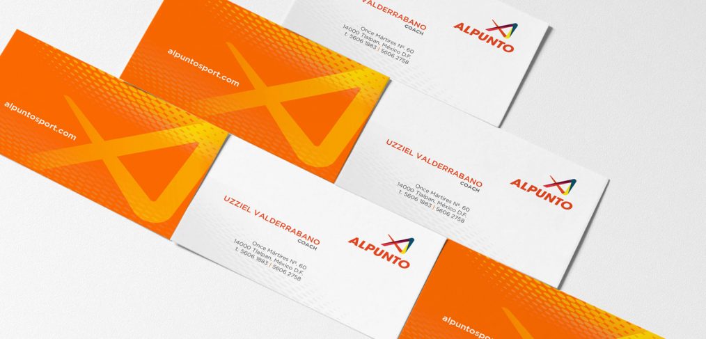
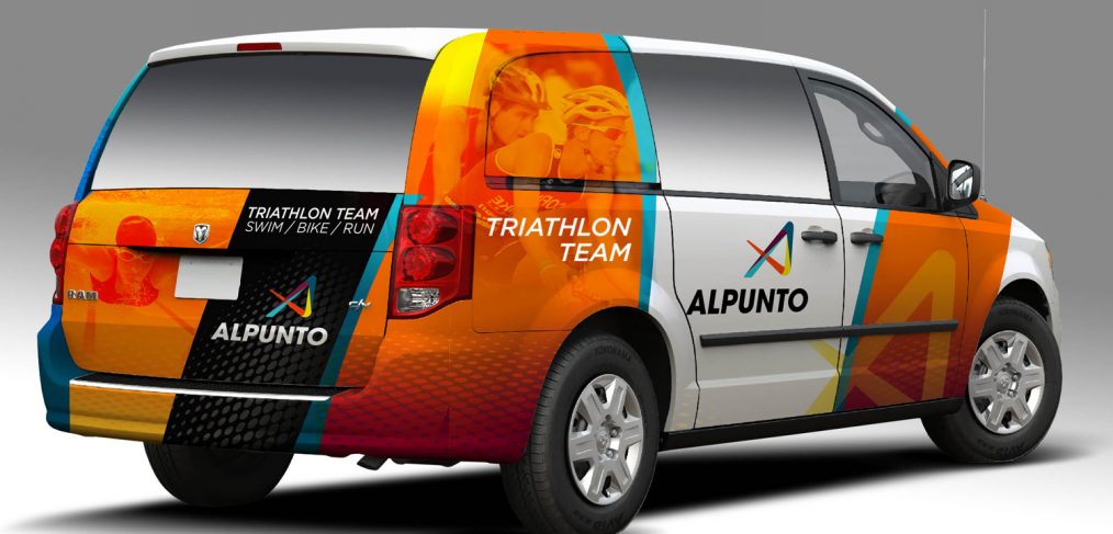
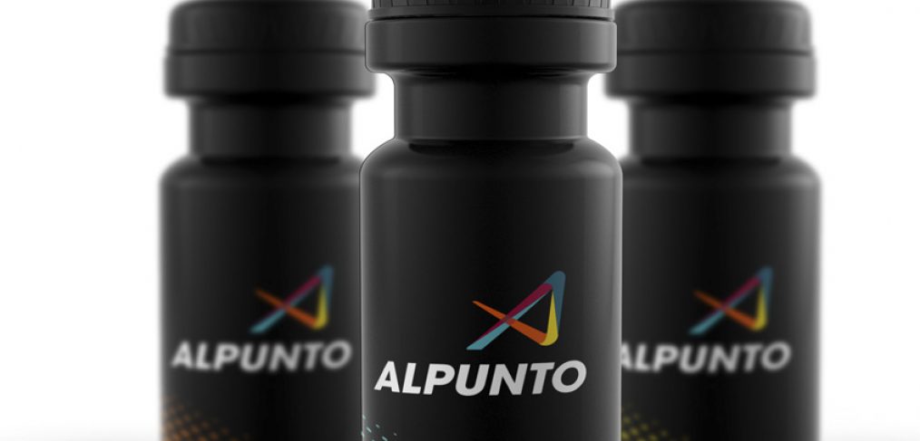
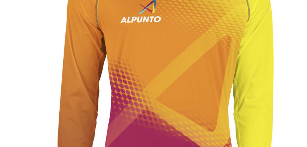
Nueva marca Alpunto. Triatlón Team México

Rediseñar una marca de triatlón fue una gran experiencia ya que pudimos desarrollar una marca que transmitiera INTENSIDAD, EXPERIENCIA y FRATERNIDAD la cual es la personalidad que el equipo Alpunto debe comunicar.
Esta marca tiene una gran oportunidad de destacarse en el medio ya que actualmente pocos equipos son los que invierten en la identidad de sus triatletas generando reconocimiento y experiencia.

El color naranja los distingue, el símbolo habla del dinamismo e intensidad transmitiendo “El máximo desempeño que hace dar lo mejor de mi”.


Brand Storytelling. Soy consciente, me importa y lo comparto.

I want to share this video with you that is very simple but very hard at the same time. This is what Storytelling in the digital age shows us, and good stories by definition must be shared.

This first video was made by the director Paul Andrew Williams from RSA Films achieving a compelling story. It highlights the abuse of older women, which often goes unnoticed as we usually focus on younger women. It’s a strong story and meets the goal of “why we should care and share.